Pattern
Cover collage
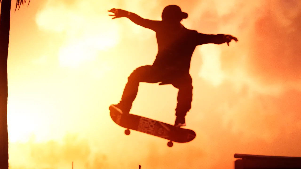
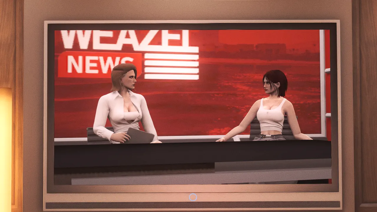
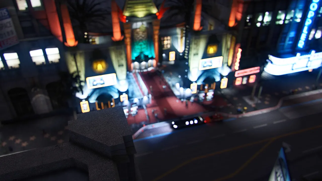
Stills laid out like the game’s box art, assembled by the scroll.
betav0.1.0 Chromium 103 ui-scale safe
Install
Copies the file into
components/ds/, with its registry dependencies and npm packages. See Installation for the one-time setup.bunx shadcn@3 add @fastrp/cover-collageExamples
Default
Aşağı kaydır




Roleplay
API
<CoverCollage />The page's GTA moment: stills laid out like the game's box art — hard black gutters, a tilted grid, the mark in the middle panel. The panels arrive scattered and the reader's scroll sets each one into place; under reduced motion they only fade.
| Prop | Type | Default | Notes |
|---|---|---|---|
| panels* | CoverPanel[] | — | |
| className | string | — | |
| layoutClassName | string | aspect-[3/4] grid-cols-2 grid-rows-[1fr_1fr_1.4fr_1fr_1fr] [grid-template-areas:'a_a'_'b_c'_'e_e'_'d_f'_'g_h'] lg:aspect-[16/10] lg:grid-cols-4 lg:grid-rows-3 lg:[grid-template-areas:'a_a_b_c'_'d_e_e_c'_'d_f_g_h'] | The grid, as classes: rows, columns and `[grid-template-areas:…]` per breakpoint. The default is the box-art layout for seven panels (`a`–`h`, `e` for the title). |
| title | ReactNode | — | What sits in the title area — a `FastBadge`, usually. |
| titleArea | string | e | The grid area the title takes. |
Dependencies
npm
- motion@^12.40.0
Registry
- @fastrp/scroll-root
- @fastrp/utils
Source
components/ds/cover-collage.tsxShowHide
'use client';

import { type MotionValue, motion, useReducedMotion, useScroll, useTransform } from 'motion/react';
import type * as React from 'react';
import { useRef } from 'react';
import { useScrollRoot } from '@/components/ds/scroll-root';
import { cn } from '@/lib/utils';

// @fast-ds [email protected]

export type CoverPanel = {
  src: string;
  alt?: string;
  /** Its `grid-area` name in the layout. */
  area: string;
  /** Where it is thrown in from before the cover assembles: pixels at 1080p, and degrees. */
  from?: { x: number; y: number; rotate: number };
};

export type CoverCollageProps = {
  panels: CoverPanel[];
  /** What sits in the title area — a `FastBadge`, usually. */
  title?: React.ReactNode;
  /** The grid area the title takes. */
  titleArea?: string;
  /**
   * The grid, as classes: rows, columns and `[grid-template-areas:…]` per breakpoint. The default
   * is the box-art layout for seven panels (`a`–`h`, `e` for the title).
   */
  layoutClassName?: string;
  className?: string;
};

const DEFAULT_LAYOUT =
  "aspect-[3/4] grid-cols-2 grid-rows-[1fr_1fr_1.4fr_1fr_1fr] [grid-template-areas:'a_a'_'b_c'_'e_e'_'d_f'_'g_h'] lg:aspect-[16/10] lg:grid-cols-4 lg:grid-rows-3 lg:[grid-template-areas:'a_a_b_c'_'d_e_e_c'_'d_f_g_h']";

function Panel({
  panel,
  progress,
  still,
}: {
  panel: CoverPanel;
  progress: MotionValue<number>;
  still: boolean;
}) {
  const from = still ? { x: 0, y: 0, rotate: 0 } : (panel.from ?? { x: 0, y: 0, rotate: 0 });
  // `--rest` runs 1 → 0 as the cover assembles. The throw is a calc on it times `--ui-px`, not
  // motion's x/y, so it scales with the FiveM NUI like every other length.
  const rest = useTransform(progress, [0, 1], [1, 0]);
  const opacity = useTransform(progress, [0, 0.5], [0, 1]);

  return (
    <motion.div
      style={
        {
          '--rest': rest,
          opacity,
          gridArea: panel.area,
          transform: `translate3d(calc(var(--rest) * ${from.x} * var(--ui-px, 1px)), calc(var(--rest) * ${from.y} * var(--ui-px, 1px)), 0) rotate(calc(var(--rest) * ${from.rotate}deg)) scale(calc(1 - var(--rest) * ${still ? 0 : 0.18}))`,
        } as unknown as React.CSSProperties
      }
      className="group relative overflow-hidden bg-ink"
    >
      <img
        src={panel.src}
        alt={panel.alt ?? ''}
        loading="lazy"
        className="absolute inset-0 size-full object-cover transition-transform duration-slower group-hover:scale-105"
      />
    </motion.div>
  );
}

/**
 * The page's GTA moment: stills laid out like the game's box art — hard black gutters, a tilted
 * grid, the mark in the middle panel. The panels arrive scattered and the reader's scroll sets
 * each one into place; under reduced motion they only fade.
 */
function CoverCollage({
  panels,
  title,
  titleArea = 'e',
  layoutClassName = DEFAULT_LAYOUT,
  className,
}: CoverCollageProps) {
  const root = useScrollRoot();
  const reduceMotion = useReducedMotion();
  const ref = useRef<HTMLDivElement>(null);
  const { scrollYProgress } = useScroll({
    container: root,
    target: ref,
    offset: ['start end', 'center center'],
  });
  const titleScale = useTransform(scrollYProgress, [0.3, 1], [reduceMotion ? 1 : 0.6, 1]);
  const titleOpacity = useTransform(scrollYProgress, [0.3, 0.8], [0, 1]);

  return (
    <div
      ref={ref}
      data-slot="cover-collage"
      className={cn(
        'mx-auto grid max-w-6xl -rotate-[1.5deg] gap-2 bg-black p-2 shadow-[0_2.5rem_6rem_-1.5rem_rgb(0_0_0/0.8)] md:gap-3 md:p-3',
        layoutClassName,
        className,
      )}
    >
      {panels.map((panel) => (
        <Panel
          key={`${panel.area}-${panel.src}`}
          panel={panel}
          progress={scrollYProgress}
          still={Boolean(reduceMotion)}
        />
      ))}
      {title && (
        <div style={{ gridArea: titleArea }} className="relative">
          <motion.div style={{ scale: titleScale, opacity: titleOpacity }} className="size-full">
            {title}
          </motion.div>
        </div>
      )}
    </div>
  );
}

export { CoverCollage };